Using the front cover from the Digipack that Jess created, I was able to use that as the main photo to advertise and emphasis the front cover of the album. I used conventions of advertising by looking at other examples of magazine adverts, and I used a colour range that suited the album colours and the colours used in the music video so it links back to both products so the audience though that they are related.
Thursday, 29 November 2012
Our Final Magazine Advert
Using the front cover from the Digipack that Jess created, I was able to use that as the main photo to advertise and emphasis the front cover of the album. I used conventions of advertising by looking at other examples of magazine adverts, and I used a colour range that suited the album colours and the colours used in the music video so it links back to both products so the audience though that they are related.
Ancillary products
When creating our ancillary products we ended up with two magazine articles which we had to choose from.
We decided to go with the one that Keri created because it follows the motif that we have been using throughout this whole music video experience. This motif being the Andy Warhol art style.
This magazine article would stand out on the page more because of the colours which are very bright and bold, whereas the other article made used dark colours.
In addition it also focuses a lot on the artist which goes with the conventions of the R&B genre we have been following.
I think both the Digipak and the magazine article would be effective in attracting our target audience because the bright colours make the album stand out and also, the picture of the artist Leksi fills the whole of the front cover of the Digipak and most of the magazine article so fans would not easily miss it.
Wednesday, 28 November 2012
Digipak Layout
Here is a possible layout of the digipak using a template for guidelines.
I wanted to include a range of photos that helped the audience to learn who the artist is and enables them to relate to the audience in terms of fashion sense etc. In addition, by using direct address and close-ups further creates this impression. I used a range of filters (sepia and cyan) and edited the images to create a more professional look. Furthermore, by using these filters, using backgrounds which I used for the green screen helps link in with our own music video as we included the same ideas.

I wanted to include a range of photos that helped the audience to learn who the artist is and enables them to relate to the audience in terms of fashion sense etc. In addition, by using direct address and close-ups further creates this impression. I used a range of filters (sepia and cyan) and edited the images to create a more professional look. Furthermore, by using these filters, using backgrounds which I used for the green screen helps link in with our own music video as we included the same ideas.
Digipak... Change of Ideas
When creating our first initial ideas (Andy Warhol style) for our Digipak on Photoshop it didn't turn out the way we expected. I had the idea of splitting the front cover image into four sections either using one photo or four different photos in each section. However, when I split the front cover into four sections using one photo it cut straight through her nose, which didn't look very professional. When researching I liked the look of Little Mix's album cover 'DNA' as this also was split into four sections similar to that of Andy Warhol's artwork. So I tried out this, with four different photos but it didn't look quite right. Therefore, I used the same idea but used more sections, but created it in a way that didn't cut through her face. Furthermore, I used four different filters over the photos to create a slightly different look but was still influenced by Andy Warhol.
Here is a possible front cover for our digipak.
Here is a possible front cover for our digipak.
Evaluation
We have finished the final editing of our video and are able to watch it back without having to change anything.
I am very pleased that we got the whole of the video finished in time, as I did not expect to get it finished by the deadline, however I now feel that if we had had a bit more time then we would have been able to improve our video a lot.
For example, there are a few shots that we did not have time to crop and therefore where there is a window behind the green screen there is a line of light in the shot that looks out of place.
There is also parts of the green screen shots where we spent a long time trying to get rid of the green outline around our singer when we put a different background behind her, but however much we tried and adjusted the settings, the green glow would not go so it looks quite unprofessional.
Another problem I have found is that when changing the background colour of the green screen, it has also changed the colour of our singer's face and arms, for example, when we changed the background to pink, her skin colour went blue.
I do however like how the Andy Warhol, different coloured, split screen went as it adds some diversity to the rest of the shots of her singing by herself. I also think that where we filtered two shots together it looks very professional and makes the video more interesting to watch as there is two things going on at once.
Monday, 26 November 2012
Magazine advert research
From looking at magazine adverts we are going to have to include....
- The name of the artist
- The title of the album
- Simple colour scheme
- Readable font (colours and font style)
- A photo of the artist
- The artist's website
- Details of album release date
- Quotes and opinions from music review, newspaper, MTV etc.
- A picture of the CD cover if different from the magazine advert.
- Price of the album if promoting in a particular place (e.g HMV and include shop logo)
Evaluation Post 2
What ideas do you have for branding/ connecting your three products?
From researching and looking at other music videos branding and how they connected their three products it appears that they use the same album covers as pictures in all products. As the digipak is an album. the images and song titles we use can not be focused on one particular image or song. Therefore we have to incorporate a variety.
During editing our music video I used a split screen that splitted into four sections and changed the colour for each image. We got this inspiration from artist and photographer Andy Warhol. So we had an idea or re-creating a similar idea for the cover of our digipak, by taking four different photos and putting them together and editing in photoshop we can create a variety of image that may appear to be from different music videos/ different songs. In addition, when researching album covers I came accross 'Little Mix's new album DNA' which attracted me as it reminded me of an Andy Warhol style as they splitted all four girls up into their own individual section like four sections of a split screen.
Furthermore, when researching
Evaluation Post 1
Did your video meet your expectations? How?
In some ways our music video did meet my expectations as having never shot a music video before I thought we had done well. We used a range of editing techniques, of which we had never used before and therefore I had to learn how to do these techniques as we are Finalcut novices. Youtube was amazing and extremely significant in the success of our music video, as I learn't many new techniques from watching tutorials which enabled me to add and experiment for myself.
In some ways our music video did meet my expectations as having never shot a music video before I thought we had done well. We used a range of editing techniques, of which we had never used before and therefore I had to learn how to do these techniques as we are Finalcut novices. Youtube was amazing and extremely significant in the success of our music video, as I learn't many new techniques from watching tutorials which enabled me to add and experiment for myself.
Photo shoot
Today I took a variety of photos for our digipak album cover. As we have to focus this around the main artist 'Leksi' I took a range of close-ups and long shots that we can use. I used the same location to do this photo shoot as we filmed our music video. I chose to use a tree and a brick wall as a background as this could be a possible a motif for our album.
Album Covers in Different Genres
From looking at different album covers in different genres, there are certain differences between how covers are made for different types of music.
In Pop and R'n'B, the main artist is the focus on the cover whether it be female or male. In the photo's, direct address is used to make the audience feel involved. Examples of this include Lady GaGa's albums 'The Fame' and 'The Fame Monster.' The artists have something that they are known for or relates to a song included in the album. In Lady GaGa's 'The Fame,' she wears the same designer sunglasses she did in her music video 'Just Dance' (of which is her number 1 hit on the album). 'The Fame Monster' on the other hand displays her quirky and unique fashion style with the unusual designer clothing and haircuts. She appears in many unusual outfits in her music videos, as well as in public to set her own star icon for the audience to recognise her with.
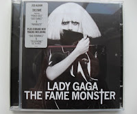
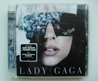
Many other star icons such as Beyonce, Katy Perry and Jessie J also use direct address in photo's, as include elements in album art work that they are recognised with (Beyonce with her curvy figure and her message of strong independent woman in her songs; Katy Perry and her abstract music videos, with bright, colourful and voyeuristic costume and Jessie J with her short black bob with straight fringe, and her designed or bright lip make-up).
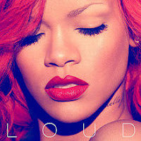
However, some also have the artists looking in a different direction or away such as in Rihanna's 'Loud' album and Adele's '21' album cover where they are looking down. In the album art work for Rihanna, she appears to have red hair and red lipstick as she has the same red hair and lips in her music videos of the songs that are in her album. Also, most of the songs on her album are about love (with the red hair and lips creating symbolism of love) of which some of them are negative such as 'Love the Way You Lie' being about partners lying and abusing each other in relationships. This may be why she is looking down as she is feeling insecure and hurt by love as she is experiencing different emotions towards it. This is the same with Adele's album cover and songs on her album '21,' where most of her songs are about breaking up with her partner. Her famous song 'Someone Like You' is expressing her best wishes for her ex and the idea she'll find someone just as good as them. The album art work is in black and white to express Adele's sadness of being hurt by love.

In Rock music, I have been looking at a few examples of album covers of this genre too. I looked at an album called 'Riot' by a band called Paramore and an album called 'What Separates Me From You' by a band called A Day To Remember. These two albums both use artistic ideas of album art work for the cover rather than the use of pictures of the band. However, the art work represents their attitudes or ideas expressed in the music included in the album. This could be a good idea for our digipak cover as our song 'Love and War' was about the artist getting frustrated over the fighting involved in their relationship.
 On Paramore's album, the word 'Riot!' is repeated over and over again to emphasis the word of the album. It looks similar to when teenagers 'doodle' in class with the scribbled pen look of the words, and the scribbled look creates edge and attitude to the album. The band were still in their late teens when they created this album which suggests the choice for the album art work, but also attracts a teenage audience, specially those who are rebellious and are into the 'emo' scene. The band themselves are regarded as this, so these type of teenagers will look up to them for inspiration.
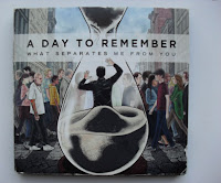 With A Day To Remember's album, there is a picture of a man in a sand timer, who is most likely watching his life pass by without him (as the man is watching people walk by without noticing he's there), hence the sand timer connoting that his time is running out. Most of the songs on the album have a negative subject within the songs, such as the song 'Better Off This Way' is about leaving someone because they are being treated badly by their partner. This suggests the reason for the negative album cover as the songs and cover link together to show the audience that the songs are about more depressing subjects. The colours on the art work are dull and dark to match with the sad emotions brought up in their music. The text on the album is in capital letters to make it stand out, with more focus on the band name by using bigger font and bold text to catch the eye of fans much easier.
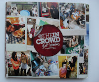 However, I found an album cover by the alternative rock band 'We Are The In Crowd' which differs from the two above and many other rock album covers. This one features pictures of the band on the front cover, with pictures of the band socially getting along well together and messing around like stereotypical carefree teenagers who like to have fun and party. This relates to the band's target audience of teenagers by making themselves relatable so that other teenagers will look up to them. The colours used on this album are bright and engaging to catch the audience's eye and make it look appealing. The band name is the text that stands out the most with bigger and bolder font than the album title to attract fans like with A Day To Remember's album.
In Pop and R'n'B, the main artist is the focus on the cover whether it be female or male. In the photo's, direct address is used to make the audience feel involved. Examples of this include Lady GaGa's albums 'The Fame' and 'The Fame Monster.' The artists have something that they are known for or relates to a song included in the album. In Lady GaGa's 'The Fame,' she wears the same designer sunglasses she did in her music video 'Just Dance' (of which is her number 1 hit on the album). 'The Fame Monster' on the other hand displays her quirky and unique fashion style with the unusual designer clothing and haircuts. She appears in many unusual outfits in her music videos, as well as in public to set her own star icon for the audience to recognise her with.


Many other star icons such as Beyonce, Katy Perry and Jessie J also use direct address in photo's, as include elements in album art work that they are recognised with (Beyonce with her curvy figure and her message of strong independent woman in her songs; Katy Perry and her abstract music videos, with bright, colourful and voyeuristic costume and Jessie J with her short black bob with straight fringe, and her designed or bright lip make-up).
However, some also have the artists looking in a different direction or away such as in Rihanna's 'Loud' album and Adele's '21' album cover where they are looking down. In the album art work for Rihanna, she appears to have red hair and red lipstick as she has the same red hair and lips in her music videos of the songs that are in her album. Also, most of the songs on her album are about love (with the red hair and lips creating symbolism of love) of which some of them are negative such as 'Love the Way You Lie' being about partners lying and abusing each other in relationships. This may be why she is looking down as she is feeling insecure and hurt by love as she is experiencing different emotions towards it. This is the same with Adele's album cover and songs on her album '21,' where most of her songs are about breaking up with her partner. Her famous song 'Someone Like You' is expressing her best wishes for her ex and the idea she'll find someone just as good as them. The album art work is in black and white to express Adele's sadness of being hurt by love.


In Rock music, I have been looking at a few examples of album covers of this genre too. I looked at an album called 'Riot' by a band called Paramore and an album called 'What Separates Me From You' by a band called A Day To Remember. These two albums both use artistic ideas of album art work for the cover rather than the use of pictures of the band. However, the art work represents their attitudes or ideas expressed in the music included in the album. This could be a good idea for our digipak cover as our song 'Love and War' was about the artist getting frustrated over the fighting involved in their relationship.
 On Paramore's album, the word 'Riot!' is repeated over and over again to emphasis the word of the album. It looks similar to when teenagers 'doodle' in class with the scribbled pen look of the words, and the scribbled look creates edge and attitude to the album. The band were still in their late teens when they created this album which suggests the choice for the album art work, but also attracts a teenage audience, specially those who are rebellious and are into the 'emo' scene. The band themselves are regarded as this, so these type of teenagers will look up to them for inspiration.
 With A Day To Remember's album, there is a picture of a man in a sand timer, who is most likely watching his life pass by without him (as the man is watching people walk by without noticing he's there), hence the sand timer connoting that his time is running out. Most of the songs on the album have a negative subject within the songs, such as the song 'Better Off This Way' is about leaving someone because they are being treated badly by their partner. This suggests the reason for the negative album cover as the songs and cover link together to show the audience that the songs are about more depressing subjects. The colours on the art work are dull and dark to match with the sad emotions brought up in their music. The text on the album is in capital letters to make it stand out, with more focus on the band name by using bigger font and bold text to catch the eye of fans much easier.
  However, I found an album cover by the alternative rock band 'We Are The In Crowd' which differs from the two above and many other rock album covers. This one features pictures of the band on the front cover, with pictures of the band socially getting along well together and messing around like stereotypical carefree teenagers who like to have fun and party. This relates to the band's target audience of teenagers by making themselves relatable so that other teenagers will look up to them. The colours used on this album are bright and engaging to catch the audience's eye and make it look appealing. The band name is the text that stands out the most with bigger and bolder font than the album title to attract fans like with A Day To Remember's album.
Wednesday, 21 November 2012
Feedback on Final cut
1. Use of conventions:
Follows the genre conventions well, follows a love relationship by showing stereotypical boy girl performances. Lots of cuts between artists and good transitions between green screens. Focuses on the artist/singer.
2. Quality of performance:
Lots of people in our group loved the enthusiastic performance from the male artist (Jake), most people said that the performance was good and strong from both people. Representing artist's well. Few said that female artist lacked emotion.
3. Narrative or abstract? Effective? :
Narrative was said to be simple and easy to follow, it was portrayed well and realistic; goes well with the genre - clearly shows a love and hate relationship. Some did not catch on to the slight narrative used but it is not what was meant to be portrayed anyway.
4. Lipsynch:
Lipsynch was good, timing errors in certain clips.
5. Use of micro elements:
People from our class has different feedback for the micro elements:
Clothing could be more appropriate, good use of green screen and editing; was in time with the music.
Good range of camera shots and effects were very good.
Cross cutting to different backgrounds is good.
Very stable camera.
Lots of green screen; helped create abstract moments.
Lots of jump cuts.
Slight glitches with the green screen.
Good clothing for both artists.
Filters good; few black spots.
6. Overall:
Rap performance is so well made.
Most of the green screens are good and on time.
Best bit was the cuts between coloured backgrounds.
Power of performance was liked.
Solos were favourited.
Male performer had great enthusiasm, fun to watch.
Jump cuts were liked.
Monday, 19 November 2012
Possible Digipak cover ideas
 As a way of using different visual and editing techniques in our music video, I came up with the idea of using a split screen with four sections and then having each section as a different colour. The inspiration came from Andy Warhol's photo/art which we researched and wrote about on the following blog post.
http://36musicvideo2012.blogspot.co.uk/2012/11/new-ideas.html
This is an example and a screen grab of how we used Andy Warhol as an inspiration in our music video.
When researching present day, modern album covers I found Little Mix's cover from their album 'DNA' which has a similar idea of using split screening and different colour backgrounds for their digipak cover.
By designing a similar cover and using these ideas will enable us to link the digipak cover in with the technique and Andy Warhol inspiration that we have used in our music video already. If we chose to use this split screen idea and change the background colour, we could take several different photos, with different poses and expressions of the main artist (Leksi) to make it look a variety. In addition, this could possibly link in with multiples of the album track names, which we have to make up, for the purpose of the digipak design.
Evaluation on our Music Video
The final cut deadline for our music video has just passed, and with our final cut produced and having watched it back, there are things I expected and didn't expect to what the outcome would be.
Firstly because of limited time to create our work and our change of plan for the style of the music video, we were rushed for time to film the footage and edit the video together, which meant we had less time to realise all our intentions for it. Many things proved difficult through filming and editing. The biggest problem that I think we had to deal with was the green screen.
Never having used it before, we relied on Youtube tutorials and instructions from tutors, but otherwise we didn't have any practise with it. We expected to film in front of it, go back to the computer and edit images and footage easily into the back of it. This proved more frustrating than thought, as the image that came through the green screen tended to create patches on the actual artists which we didn't want. Sometimes it left a green outline around the artist, but this was due to the editing software we were using as it is not a professional program. When actually filming in front of the green screen, we found that a line of light from behind the green screen (most likely light coming through the blinds of the window) came through it and could be seen in our video and could not be hidden with an image.
The images we used behind the artists were good with the idea we wanted of lights shining in the background, but I think it would have been better if we filmed footage of lights to go under them to create movement, and make the shots more interesting. We used one shot like this, but felt it would make the video boring using it over and over again.
The images we used behind the artists were good with the idea we wanted of lights shining in the background, but I think it would have been better if we filmed footage of lights to go under them to create movement, and make the shots more interesting. We used one shot like this, but felt it would make the video boring using it over and over again.
While on the subject of editing (which proved to be the hardest obstacle to come by), we also had problems with lip syncing. We found it very difficult to fit the lip syncing by our artists in with the words of our song choice. If we had more time, we could have used tools to speed or slow down their lip sync. However saying that, both our artists gave a great performance and added 'swagger' or 'attitude' into our video, which is found in may R'n'B music videos. I also thought the costume choice was good as they were subtle and were dark colours to connote the worried and sad feelings the artists had about fighting in their relationship. It was also casual clothing, which is common in most R'n'B and Pop music videos to capture the latest fashion trends popular with teenagers and young adults (which is our target audience we were aiming for, hence the choice of costume).
I believe the camera frames of the artists were neatly framed, and we used a variety of effects in our editing such as the jump cuts in the beginning, rapid shot reverse shots to fit footage to the beat of the music and split screens to show the audience 2 different sides of the artists' relationship. The variety of editing effects made our video eye-catching to engage the audience for longer. Saying this, I believe we could have edited more footage into the editing and created more cuts to make the editing more faster and youthful to fit with our target audience. However, we had a short time period, and did not get around to achieving this.
During our experience of filming a music video, I have learnt how to use a green screen and more in depth tools of Final Cut such as chroma key to get images on the green screen and colour corrector to change the colours of shots. I have also learnt from the problems encountered during editing such as the demand of cuts and footage to make a music video interesting, as we could have filmed more footage with our artist's in different costumes and locations to add more variety, thus more for the audience to appreciate about what they are watching.
Researching R&B song Titles for our Track List on Digipak
As we are designing a digipak, to be based around our music video, we are going to need to come up with a few ideas on possible album tracks that are similar and may relate to Rita Ora's song 'Love and War' (the song we chose for our music video). Rita Ora is an R&B star, so all the possible album tracks would have to fit the genre of R&B.
From looking at R&B artists songs and their titles, the most dominant topic and focused matter appears to be based around personal experiences and their life, including singing about the ups and downs of relationships, singing about a loved one etc. This is similar to our music video song 'Love and War' which is also about the ups and downs of relationships.
From looking at R&B artists songs and their titles, the most dominant topic and focused matter appears to be based around personal experiences and their life, including singing about the ups and downs of relationships, singing about a loved one etc. This is similar to our music video song 'Love and War' which is also about the ups and downs of relationships.
Thursday, 15 November 2012
Font ideas
For our digipak, I looked at other album covers from similar artists to get an idea of typical conventions of fonts used. I got the idea that most fonts are usually very simple but very bold - usually in capitals so that it stands and looks like it is making a statement.
This Rihanna album cover is an example of simple bold font. it also shows the name of the album in bold capitals too. This goes with the theme of the album and is it called 'LOUD' and often in writing when something is loud you write it in capitals to put emphasis on it.
This has helped a lot with picking the font for the digipak as we now know what is conventional for our genre of music :
Final cut deadline
Today is the final cut deadline, and we are very worried that we will not get it all of the editing done in time.
To make sure that we do get everything done we have decided to cut the piece of music down from 3 minutes to 2 minutes as a lot of the other groups are doing pieces of music that are only 2 minutes long and also this means that we only have a few more gaps to fill before we are finished. We have cut the music at a spot similar to the actual end of the song and faded it out so it sounds like a realistic ending to a song.
We are also double checking that all of the green screens look right and that the lip syncing is matched up with the shots.
Hopefully we get it all done today and then we can start with our digipaks and magazine adverts!
Artist names...
For our artist we wanted a name that would fit in well with the genre of music. We also need to be able to put the name on the Digipak and magazine advert so I have done some research into different names.
Some R&B artists use simply there first name as it is short, simple and straight to the point - it is not as formal and when the audience calls them by the first name it is like they are friends so it could possibly help the audience and fans relate to the artists and feel more like the artist is a normal person instead of a star.
For example stars such as Rihanna and Beyonce use only their first names, it is bold and stands out which matchs their personality and their music. It also looks very bold on their album covers.
This has influenced me to use only our artist's first name on the digipak. Her name is Leksi which is quite different which fits in with today's society and fashion of being 'hipster.'
Thursday, 8 November 2012
Using Colour corrector
I have found a Youtube tutorial that shows us how to use Colour corrector which will enable us to create the Andy Warhol ideas.
Wednesday, 7 November 2012
New Ideas....
Today, Keri and I were thinking of ways to vary our use of techniques throughout our music video. I came up with the idea of using the same shot but showing it multiple times in split screens. To make it even more interesting I came up with idea that each one of the four shots should have different background colours. The inspiration came from the artist and photographer Andy Warhol.
Another idea was to use this idea, but each shot comes in and out at different times. For instance some of the shots in the split screen are paused (in a freeze frame) whilst other shots shows the artist singing.
Below is a Youtube Tutorial showing how to make freeze frames in Final Cut Express:
Another idea was to use this idea, but each shot comes in and out at different times. For instance some of the shots in the split screen are paused (in a freeze frame) whilst other shots shows the artist singing.
Below is a Youtube Tutorial showing how to make freeze frames in Final Cut Express:
Monday, 5 November 2012
Rough Cut Feedback
1. Have they shot material appropriate for a music video?
- Q3-33: Yes when green screen sequence is finished
2. Has close attention been paid to mise-en-scene?
- Q3-31/32/33: green screen worked well and back drop is good.
3. Is there controlled use of the camera?
- Q3-31: Other than the second shot, yes.
4. Is there variety of shot type and angles?
- Q3-31/33: Yes. Different shots in start.
5. Is there appropriate use of transitions and other effects?
- Q3-31/32/33: Green screen works well along with jump cuts at beginning.
6. Does the pace of the editing work well with the pace of the song?
- Q3-32: Yes particularly at beginning of the video
7. If there is lip syncing is it effective?
- Q3-32: Good lip syncing
8. Is the video effective at communicating a star persona?
-Q3-32: They have centralisation around main character
- Q3-33: Shows artist clearly and well
9. Do you think they need to re-film anything?
- Q3-32: Not enough footage to tell, but looks like a variety of locations and effects and used well
- Q3-33: Not enough footage to tell.
Rough Cut
This is our rough cut, we have not got far due to difficulties changing the green screen background.
Subscribe to:
Comments (Atom)


+Made+by+-.jpg)


