- The name of the artist
- The title of the album
- Simple colour scheme
- Readable font (colours and font style)
- A photo of the artist
- The artist's website
- Details of album release date
- Quotes and opinions from music review, newspaper, MTV etc.
- A picture of the CD cover if different from the magazine advert.
- Price of the album if promoting in a particular place (e.g HMV and include shop logo)
Monday, 26 November 2012
Magazine advert research
From looking at magazine adverts we are going to have to include....

Evaluation Post 2
What ideas do you have for branding/ connecting your three products?
From researching and looking at other music videos branding and how they connected their three products it appears that they use the same album covers as pictures in all products. As the digipak is an album. the images and song titles we use can not be focused on one particular image or song. Therefore we have to incorporate a variety.
During editing our music video I used a split screen that splitted into four sections and changed the colour for each image. We got this inspiration from artist and photographer Andy Warhol. So we had an idea or re-creating a similar idea for the cover of our digipak, by taking four different photos and putting them together and editing in photoshop we can create a variety of image that may appear to be from different music videos/ different songs. In addition, when researching album covers I came accross 'Little Mix's new album DNA' which attracted me as it reminded me of an Andy Warhol style as they splitted all four girls up into their own individual section like four sections of a split screen.
Furthermore, when researching
From researching and looking at other music videos branding and how they connected their three products it appears that they use the same album covers as pictures in all products. As the digipak is an album. the images and song titles we use can not be focused on one particular image or song. Therefore we have to incorporate a variety.
During editing our music video I used a split screen that splitted into four sections and changed the colour for each image. We got this inspiration from artist and photographer Andy Warhol. So we had an idea or re-creating a similar idea for the cover of our digipak, by taking four different photos and putting them together and editing in photoshop we can create a variety of image that may appear to be from different music videos/ different songs. In addition, when researching album covers I came accross 'Little Mix's new album DNA' which attracted me as it reminded me of an Andy Warhol style as they splitted all four girls up into their own individual section like four sections of a split screen.
Furthermore, when researching
Evaluation Post 1
Did your video meet your expectations? How?
In some ways our music video did meet my expectations as having never shot a music video before I thought we had done well. We used a range of editing techniques, of which we had never used before and therefore I had to learn how to do these techniques as we are Finalcut novices. Youtube was amazing and extremely significant in the success of our music video, as I learn't many new techniques from watching tutorials which enabled me to add and experiment for myself.
In some ways our music video did meet my expectations as having never shot a music video before I thought we had done well. We used a range of editing techniques, of which we had never used before and therefore I had to learn how to do these techniques as we are Finalcut novices. Youtube was amazing and extremely significant in the success of our music video, as I learn't many new techniques from watching tutorials which enabled me to add and experiment for myself.
Photo shoot
Today I took a variety of photos for our digipak album cover. As we have to focus this around the main artist 'Leksi' I took a range of close-ups and long shots that we can use. I used the same location to do this photo shoot as we filmed our music video. I chose to use a tree and a brick wall as a background as this could be a possible a motif for our album.
Album Covers in Different Genres
From looking at different album covers in different genres, there are certain differences between how covers are made for different types of music.
In Pop and R'n'B, the main artist is the focus on the cover whether it be female or male. In the photo's, direct address is used to make the audience feel involved. Examples of this include Lady GaGa's albums 'The Fame' and 'The Fame Monster.' The artists have something that they are known for or relates to a song included in the album. In Lady GaGa's 'The Fame,' she wears the same designer sunglasses she did in her music video 'Just Dance' (of which is her number 1 hit on the album). 'The Fame Monster' on the other hand displays her quirky and unique fashion style with the unusual designer clothing and haircuts. She appears in many unusual outfits in her music videos, as well as in public to set her own star icon for the audience to recognise her with.
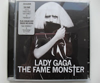
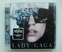
Many other star icons such as Beyonce, Katy Perry and Jessie J also use direct address in photo's, as include elements in album art work that they are recognised with (Beyonce with her curvy figure and her message of strong independent woman in her songs; Katy Perry and her abstract music videos, with bright, colourful and voyeuristic costume and Jessie J with her short black bob with straight fringe, and her designed or bright lip make-up).


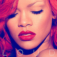
However, some also have the artists looking in a different direction or away such as in Rihanna's 'Loud' album and Adele's '21' album cover where they are looking down. In the album art work for Rihanna, she appears to have red hair and red lipstick as she has the same red hair and lips in her music videos of the songs that are in her album. Also, most of the songs on her album are about love (with the red hair and lips creating symbolism of love) of which some of them are negative such as 'Love the Way You Lie' being about partners lying and abusing each other in relationships. This may be why she is looking down as she is feeling insecure and hurt by love as she is experiencing different emotions towards it. This is the same with Adele's album cover and songs on her album '21,' where most of her songs are about breaking up with her partner. Her famous song 'Someone Like You' is expressing her best wishes for her ex and the idea she'll find someone just as good as them. The album art work is in black and white to express Adele's sadness of being hurt by love.

In Rock music, I have been looking at a few examples of album covers of this genre too. I looked at an album called 'Riot' by a band called Paramore and an album called 'What Separates Me From You' by a band called A Day To Remember. These two albums both use artistic ideas of album art work for the cover rather than the use of pictures of the band. However, the art work represents their attitudes or ideas expressed in the music included in the album. This could be a good idea for our digipak cover as our song 'Love and War' was about the artist getting frustrated over the fighting involved in their relationship.
 On Paramore's album, the word 'Riot!' is repeated over and over again to emphasis the word of the album. It looks similar to when teenagers 'doodle' in class with the scribbled pen look of the words, and the scribbled look creates edge and attitude to the album. The band were still in their late teens when they created this album which suggests the choice for the album art work, but also attracts a teenage audience, specially those who are rebellious and are into the 'emo' scene. The band themselves are regarded as this, so these type of teenagers will look up to them for inspiration.
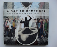 With A Day To Remember's album, there is a picture of a man in a sand timer, who is most likely watching his life pass by without him (as the man is watching people walk by without noticing he's there), hence the sand timer connoting that his time is running out. Most of the songs on the album have a negative subject within the songs, such as the song 'Better Off This Way' is about leaving someone because they are being treated badly by their partner. This suggests the reason for the negative album cover as the songs and cover link together to show the audience that the songs are about more depressing subjects. The colours on the art work are dull and dark to match with the sad emotions brought up in their music. The text on the album is in capital letters to make it stand out, with more focus on the band name by using bigger font and bold text to catch the eye of fans much easier.
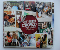 However, I found an album cover by the alternative rock band 'We Are The In Crowd' which differs from the two above and many other rock album covers. This one features pictures of the band on the front cover, with pictures of the band socially getting along well together and messing around like stereotypical carefree teenagers who like to have fun and party. This relates to the band's target audience of teenagers by making themselves relatable so that other teenagers will look up to them. The colours used on this album are bright and engaging to catch the audience's eye and make it look appealing. The band name is the text that stands out the most with bigger and bolder font than the album title to attract fans like with A Day To Remember's album.
In Pop and R'n'B, the main artist is the focus on the cover whether it be female or male. In the photo's, direct address is used to make the audience feel involved. Examples of this include Lady GaGa's albums 'The Fame' and 'The Fame Monster.' The artists have something that they are known for or relates to a song included in the album. In Lady GaGa's 'The Fame,' she wears the same designer sunglasses she did in her music video 'Just Dance' (of which is her number 1 hit on the album). 'The Fame Monster' on the other hand displays her quirky and unique fashion style with the unusual designer clothing and haircuts. She appears in many unusual outfits in her music videos, as well as in public to set her own star icon for the audience to recognise her with.


Many other star icons such as Beyonce, Katy Perry and Jessie J also use direct address in photo's, as include elements in album art work that they are recognised with (Beyonce with her curvy figure and her message of strong independent woman in her songs; Katy Perry and her abstract music videos, with bright, colourful and voyeuristic costume and Jessie J with her short black bob with straight fringe, and her designed or bright lip make-up).


However, some also have the artists looking in a different direction or away such as in Rihanna's 'Loud' album and Adele's '21' album cover where they are looking down. In the album art work for Rihanna, she appears to have red hair and red lipstick as she has the same red hair and lips in her music videos of the songs that are in her album. Also, most of the songs on her album are about love (with the red hair and lips creating symbolism of love) of which some of them are negative such as 'Love the Way You Lie' being about partners lying and abusing each other in relationships. This may be why she is looking down as she is feeling insecure and hurt by love as she is experiencing different emotions towards it. This is the same with Adele's album cover and songs on her album '21,' where most of her songs are about breaking up with her partner. Her famous song 'Someone Like You' is expressing her best wishes for her ex and the idea she'll find someone just as good as them. The album art work is in black and white to express Adele's sadness of being hurt by love.


In Rock music, I have been looking at a few examples of album covers of this genre too. I looked at an album called 'Riot' by a band called Paramore and an album called 'What Separates Me From You' by a band called A Day To Remember. These two albums both use artistic ideas of album art work for the cover rather than the use of pictures of the band. However, the art work represents their attitudes or ideas expressed in the music included in the album. This could be a good idea for our digipak cover as our song 'Love and War' was about the artist getting frustrated over the fighting involved in their relationship.
 On Paramore's album, the word 'Riot!' is repeated over and over again to emphasis the word of the album. It looks similar to when teenagers 'doodle' in class with the scribbled pen look of the words, and the scribbled look creates edge and attitude to the album. The band were still in their late teens when they created this album which suggests the choice for the album art work, but also attracts a teenage audience, specially those who are rebellious and are into the 'emo' scene. The band themselves are regarded as this, so these type of teenagers will look up to them for inspiration.
 With A Day To Remember's album, there is a picture of a man in a sand timer, who is most likely watching his life pass by without him (as the man is watching people walk by without noticing he's there), hence the sand timer connoting that his time is running out. Most of the songs on the album have a negative subject within the songs, such as the song 'Better Off This Way' is about leaving someone because they are being treated badly by their partner. This suggests the reason for the negative album cover as the songs and cover link together to show the audience that the songs are about more depressing subjects. The colours on the art work are dull and dark to match with the sad emotions brought up in their music. The text on the album is in capital letters to make it stand out, with more focus on the band name by using bigger font and bold text to catch the eye of fans much easier.
  However, I found an album cover by the alternative rock band 'We Are The In Crowd' which differs from the two above and many other rock album covers. This one features pictures of the band on the front cover, with pictures of the band socially getting along well together and messing around like stereotypical carefree teenagers who like to have fun and party. This relates to the band's target audience of teenagers by making themselves relatable so that other teenagers will look up to them. The colours used on this album are bright and engaging to catch the audience's eye and make it look appealing. The band name is the text that stands out the most with bigger and bolder font than the album title to attract fans like with A Day To Remember's album.
Wednesday, 21 November 2012
Feedback on Final cut
1. Use of conventions:
Follows the genre conventions well, follows a love relationship by showing stereotypical boy girl performances. Lots of cuts between artists and good transitions between green screens. Focuses on the artist/singer.
2. Quality of performance:
Lots of people in our group loved the enthusiastic performance from the male artist (Jake), most people said that the performance was good and strong from both people. Representing artist's well. Few said that female artist lacked emotion.
3. Narrative or abstract? Effective? :
Narrative was said to be simple and easy to follow, it was portrayed well and realistic; goes well with the genre - clearly shows a love and hate relationship. Some did not catch on to the slight narrative used but it is not what was meant to be portrayed anyway.
4. Lipsynch:
Lipsynch was good, timing errors in certain clips.
5. Use of micro elements:
People from our class has different feedback for the micro elements:
Clothing could be more appropriate, good use of green screen and editing; was in time with the music.
Good range of camera shots and effects were very good.
Cross cutting to different backgrounds is good.
Very stable camera.
Lots of green screen; helped create abstract moments.
Lots of jump cuts.
Slight glitches with the green screen.
Good clothing for both artists.
Filters good; few black spots.
6. Overall:
Rap performance is so well made.
Most of the green screens are good and on time.
Best bit was the cuts between coloured backgrounds.
Power of performance was liked.
Solos were favourited.
Male performer had great enthusiasm, fun to watch.
Jump cuts were liked.
Follows the genre conventions well, follows a love relationship by showing stereotypical boy girl performances. Lots of cuts between artists and good transitions between green screens. Focuses on the artist/singer.
2. Quality of performance:
Lots of people in our group loved the enthusiastic performance from the male artist (Jake), most people said that the performance was good and strong from both people. Representing artist's well. Few said that female artist lacked emotion.
3. Narrative or abstract? Effective? :
Narrative was said to be simple and easy to follow, it was portrayed well and realistic; goes well with the genre - clearly shows a love and hate relationship. Some did not catch on to the slight narrative used but it is not what was meant to be portrayed anyway.
4. Lipsynch:
Lipsynch was good, timing errors in certain clips.
5. Use of micro elements:
People from our class has different feedback for the micro elements:
Clothing could be more appropriate, good use of green screen and editing; was in time with the music.
Good range of camera shots and effects were very good.
Cross cutting to different backgrounds is good.
Very stable camera.
Lots of green screen; helped create abstract moments.
Lots of jump cuts.
Slight glitches with the green screen.
Good clothing for both artists.
Filters good; few black spots.
6. Overall:
Rap performance is so well made.
Most of the green screens are good and on time.
Best bit was the cuts between coloured backgrounds.
Power of performance was liked.
Solos were favourited.
Male performer had great enthusiasm, fun to watch.
Jump cuts were liked.
Subscribe to:
Posts (Atom)